Phizzwizzard Advertising campaign
Aims and objectives:
Carter Soft Drinks aim is to get their brand/product across to a wider audience, alongside introducing a new product that has a unique selling point of being a healthy, sugar-free drink. They want brand recognition and overall want to sell their product to a greater audience.
Target audience:
Their product is aimed at two different target audience ages. One which is 30-something, and they are more likely to have a higher income and be more health conscious. The other target audience is young people aged 13-18, and they are around the ages of school children, so have a low income and may or may not have a part time job. They are more likely to use social media links such as Snap Chat and Tik Tok, whereas people aged 30-something are more likely to use social media links like Facebook and Instagram, meaning if it's spread to social media apps and links, a large amount of people will see this.
Key messages and purpose:
Carter Soft Drink uses a USP in their advert which is that their drink is sugar free and healthy. This helps to prove to people they're different and not like all other fizzy drinks, which are unhealthy and full of sugar. Their message is also that they bring a lot of fun and joy to people, through the use of colours and flavours, which gives positive vibes.
Call
to action:
I would have a slogan such as 'Fizz it up' which would encourage people to buy the fizzy drink as the slogan refers to the enjoyment in which it brings you and is telling people that if you buy it, it gives you very positive vibes and brings a lot of happiness and joy into what you're doing and when spending this with others.
Media choices and content:
Outdoor:poster
A poster is a great way of advertising as it allows you to spread your message to a wide audience. This is good as the campaign is aimed at two target audiences- both of which are very different and in need of different ways of reaching their campaign out to them. A poster sums up the drink as a whole, without it looking too 'busy' and leading people to becoming lost and confused within it.
The design of this poster is simple, but bold and eye-catching. By having the drink image central, taking up the majority of the poster, it allows people to notice this and become drawn to the poster. The use of blue circling the can allows it to become more eye-catching, and the colour blue gives connotations of it being refreshing and in time for summer when it's warmer weather. The other colour used (red), links to the flavouring of the drink being strawberry laces, and the colour of the drink liquid itself being red. Red is a bold colour that gives off joy and excitement, which is what the drink is about, as it should bring happiness and positivity to people.
Online: social media

Advertising through social media is a good way of sharing a campaign and allowing it to spread as people can share it to their friends and family, which allows more people to see it and get involved within the campaign. Social media includes things like SnapChat, Instagram and Facebook- all of which are used by a range of people of different ages. The use of the rhetorical question helps engage people as they feel the need to read on, and the use of having the 'learn more' link in red helps people find and access it quickly and easily. The language within the text used is basic so it can be understood by all ages, and because there's not a lot of text, people are more likely to read on because its not time consuming or effort for them. The image of the drink is what draws in the attention of people because it's their product and is what people would initially see before reading the text surrounding it. The drink being held by a hand shows it being passed to you, and to grab your own! By including the fact its sugar free etc, it allows people to know that just because it's a fizzy drink, it's not like most others in which they're full of sugar and extremely unhealthy.
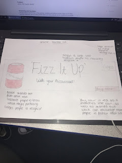
Online: Banner ad
The use of banner ads are good because by using it on as many websites and online links as possible, it's able to reach a larger audience, meaning more people will see the campaign and become involved. By advertising on different websites, it enables a greater range of people to read into the campaign, helping it to reach the two target audiences and more. By having minimal text on the ad, it doesn't become 'too much' for people to read and people are more likely to read and look at it. I've decided to keep this design of ad simplistic as it enables a higher chance of people to get involved. By having the can with the slogan, people are able to recognise the campaign and know straight away what it's about. By also having the logo on it, people can then recognise future adverts by them. Within the ad, i've also included 'with your Phizzwizzard', so this way it feels more personalised and aimed at individuals.
I would have the 'Fizz It Up' in font Arial, and the 'with your Phizzwizzard' in Arial Narrow, which allows the 'Fizz It Up' to stand out slightly more, but the font is also simple and easy to read, so nobody should have difficulty trying to read it. All text will be in black, but of different sizes, so some stands out more than others, and the can of drink will be red, alongside the 'buy now' bar to show these link together and helps people to quickly access and purchase their own can.
Content:
Resources and personnel:
I would need a model for the social media ad as this involves a person holding the can, and I'd need a photographer to take this picture. I would also need graphic designers to help make the adverts and people who can use the appropriate and relevant software.
Scheduling and key dates:
I would want to launch this in the summer, possibly just before schools break up for their summer holidays, as it is a fizzy drink which are more popular in hot conditions, as people want a refreshing drink to cool them down. As one of the target audiences is 13-18 years of age, launching it ready for their summer holidays is convenient as they can then buy it and share/spend time with their friends.
Distribution methods:
I would use social media- Instagram, Snap Chat and Facebook- as these are apps in which the majority of 13-18 year old's and people aged 30-something use. This would be the best way to get the attention of the audience, and this way they're also able to share it to friends and family, making it easier to reach a larger range of people. Billboards at places such as bus stops would also be a good place to advertise the drink as the target audience are those of who will be travelling to and from school and work, so will be able to see these on their travels.
Resources and personnel:
I will need access to a camera to be able to take photos and videos of this product to make the adverts. I will need models and actors to be apart of the adverts to help get people's attention and with the right people used, this will help people to know who this is aimed for. A computer will also be needed to edit at the end and to make the final changes and adjustments.
Research into conventions:
Conventions for a poster for a bus stop are large images of the product, which stands out more than the text, a slogan or short sentence referring to the brand or product, and the logo at the bottom of the poster.
Conventions for a TV video advert are people of the target audience age featured with or using the product being advertised, the logo and a web link at the end of the advert, and good things written about it, for example no sugar, no calories etc.
Conventions for a social media advert would be an image referring to the product/brand, a link to the website, or a 'learn more' or 'buy now', possibly a rhetorical question, and a short comment at the top to engage people before they then read more.
Conventions for a billboard are using a slogan, large image covering the majority or whole of the screen, and a logo at the bottom.
Conventions for a banner ad are a slogan, small image of the product, 'shop now' or 'learn more' bar, and a logo.
Research into competitors:
Oasis drink makes a lot of jokes within their advertising, which helps to engage the audience and make it seem enjoyable and positive. Their ads are simple but they use eye-catching, bright colours, and because of the design, its easily recognisable and they use a slogan of 'refreshing stuff' which is easy to remember and helps to sell their product.
Coke's 'Share a coke' campaign was very engaging due to their happiness in which their drink brought to people, and people were able to personalise their own bottles. They got this across to the audience through the use of their large advertising ways, by sharing through social media, hashtags, video ads, banners etc. They used their slogan throughout their advertising and kept to their basic, recognisable colour of red. Fanta drink also made jokes within their advertising, to engage the audience and make them laugh. They used the colours of orange and yellow which are positive, bright, eye-catching colours. They used slogans within their ads to help the audience remember and recognise them.
Planning documents:
A treatment for the video advert- My video ad will be titles 'Fizz it up with Phizzwizzard' as the slogan is 'Fizz it up' so it should be included within the title of the video ad. The ad will last roughly 60 seconds long so it gives people the opportunity to get to know the drink and the campaign, but it isn't too long that it bores the audience and wastes their time.
My video ad will include people (teenagers) spending time together and one of them will look a bit sad/low and they will be passed the Phizzwizard drink from a friend which makes them happier and full of joy. From that, the friends then spend time together which is enjoyed and upbeat as the drink has boosted her mood. I will have a group of about 4/5 people within the group and it will be located in a field or someone's garden, where teenagers tend to spend their time together.
I will be using a camera and lighting as it will be filmes outside so the lighting won't be the best. I won't use music throughout the entire video, but at certain points I may play music or have sound effects to increase their concentration on the ad.
Sketches
Poster

Social media
Banner ad
List of assets (multimedia) needed:
A camera would be needed to take the images that will be used in the adverts. A camera or good quality phone would work for a simplistic picture for the adverts. Lighting will need to be considered- so if it has to be taken or a day where it's dull or the lighting isn't great, then lights could be used to help brighten the pictures.
A computer will be needed to used to edit the photos taken, and this will include editing software and photoshop, to change the lighting, edit the background and make the images more appealing and eye-catching.
Release forms, Risk assessment and recce:
Contingency plan:
M2: Justify the choice of planned components by targeted media sector:
Social media:
I have decided to do a social media advert because this is a very popular way of advertising, as many people are now on different types of social media apps, which means the advert is more likely to be seen by a range or people and become more popular and well-known quickly. I have also chosen Social Media as it's a great way of spreading a campaign as it allows people to share it with their friends and family to encourage each other to get involved, which allows more people to see and become included within the campaign, making it more popular. Social media consists of people of a variety of ages, both young and old, meaning everyone can get involved, making the audience greater.
The use of a rhetorical question at the top of the advert helps to engage people as they feel the need to read on, and by using the words 'refreshing' and 'summer' in the question, it would hopefully bring enjoyment and happiness to people as they begin to think about summer and the bright and hot weather. The use of having the 'learn more' link in red helps people find and access it quickly and easily. The 'Learn more' is in red as it matches the can and also stands out so people know what to do to get more information on the campaign. Red is typically a bold colour that brings excitement and energy to people. The rest of the text is in black, as it allows the image of the Phizzwizzard can to stand out. Black is a simple colour, but it can also be seen as a mysterious, but powerful colour. These colours help express the drink as it shows how the drink gives you energy and brings you excitement and power. I am using the fonts 'Arial' and 'Narrow Arial' as they are basic and easily readable, and the text within this ad isn't of much, so people are more likely to read it/take interest in it because its not time consuming or effort for them to read.
The image of the drink is being held by a person's hand, which is showing it to be passed to you, so you can grab your own. I have decided to have the image of the hand holding the can coming from the side, to the centre of the advert so it's typically the first thing everyone will notice, and this is what will hopefully draw them in to then read the text around the image of the can.
Poster:
I have decided to do a poster as they are a great way of advertising, as it allows you to spread your message to a wide audience. The Phizzwizzard campaign is aimed at two target audiences, which are of very different ages, so the use of a poster would hopefully be able to reach both audiences and more. Posters are very good at getting people's attention, which is why I'm using it to advertise the drink as the poster is simple and doesn't look too 'busy', which encourages more people to look at it and it helps to sum the drink up as a whole. The text on the poster is very minimal so it doesn't look messy or becomes too much for people to read. By having minimal text, it allows people of different ages to be able to read it, and it's in fonts 'Arial' and 'Narrow Arial', which are easily readable. The 'Strawberry Laces' will be slightly larger than the other text on the poster as this is the flavour and what will hopefully intrigue people to get involved.
The layout of the poster is easily readable and by having the image of the can central and taking up the majority of the poster, it allows people to notice this and become drawn to the poster. By firstly getting the attention of people by the large image of the can, it then allows them to then read the text around it and find out more about the drink. As well as the large image of the can, the blue circling the drink allows it to become even more eye-catching and refers to it as to being a refreshing drink for summer time. The colour blue gives connotations of it being refreshing, but also reminds you of the sea and sky, which could then link to it being summer also. The majority of the text on the poster is red, which links to the flavouring of the drink being of strawberry laces, and the colour of the liquid itself being red. Red is a bold colour that gives off joy and excitement, which is what the drink is about, so by having the colour red involved, it not only fits in with the colour scheme, but it should hopefully bring positivity and happiness to people. This also links to the ice around the can, as the poster continues to give of refreshing and summer vibes.
Banner ad:
I have decided to do a banner ad because they are a great way of advertising to a range of people as you can use them on as many websites and online links as possible, and by doing this it can reach a larger audience, meaning more people will see the campaign and become involved. As banner ads can reach different types of people, it should make it easier to reach the two target audiences for this campaign. Like the other ads, this also has minimal text so it's easy for people to read and know how to become involved. This also helps to not take the focus off the drink itself. The drink will be on the left side of the ad, with all the text on the right, but the can will also be larger than the text so it's bold and stands out, and is what people will see first. The overall design of this ad is very simplistic, but by having the can standing out, it enables a higher chance of people to get involved, and people can then begin to recognise the campaign each time they come across it.
The slogan 'Fizz It Up' helps encourage people to buy the fizzy drink as the slogan refers to the enjoyment in which the drink brings you and that if you purchase it, it brings you happiness and joy. The 'Fizz It Up' will be in font Arial, and the 'with your Phizzwizzard' in Arial Narrow, as this allows the 'Fizz It Up' to stand out slightly more, and this will also be in a larger text so is eye-catching and is the main part of the text people see. All the text will be in black, so it doesn't overpower the image of the drink, as banner ads tend to be quite small, so this will help to still allow the image of the can to stand out. Although, the 'buy now' will be in red as this links to the drink, but also stands out so if people want to get involved, it's easy for them to do so. By saying 'with your Phizzwizzard', it allows it to feel more personalised to the person seeing the ad, and will encourage them to purchase a can.


Comments
Post a Comment